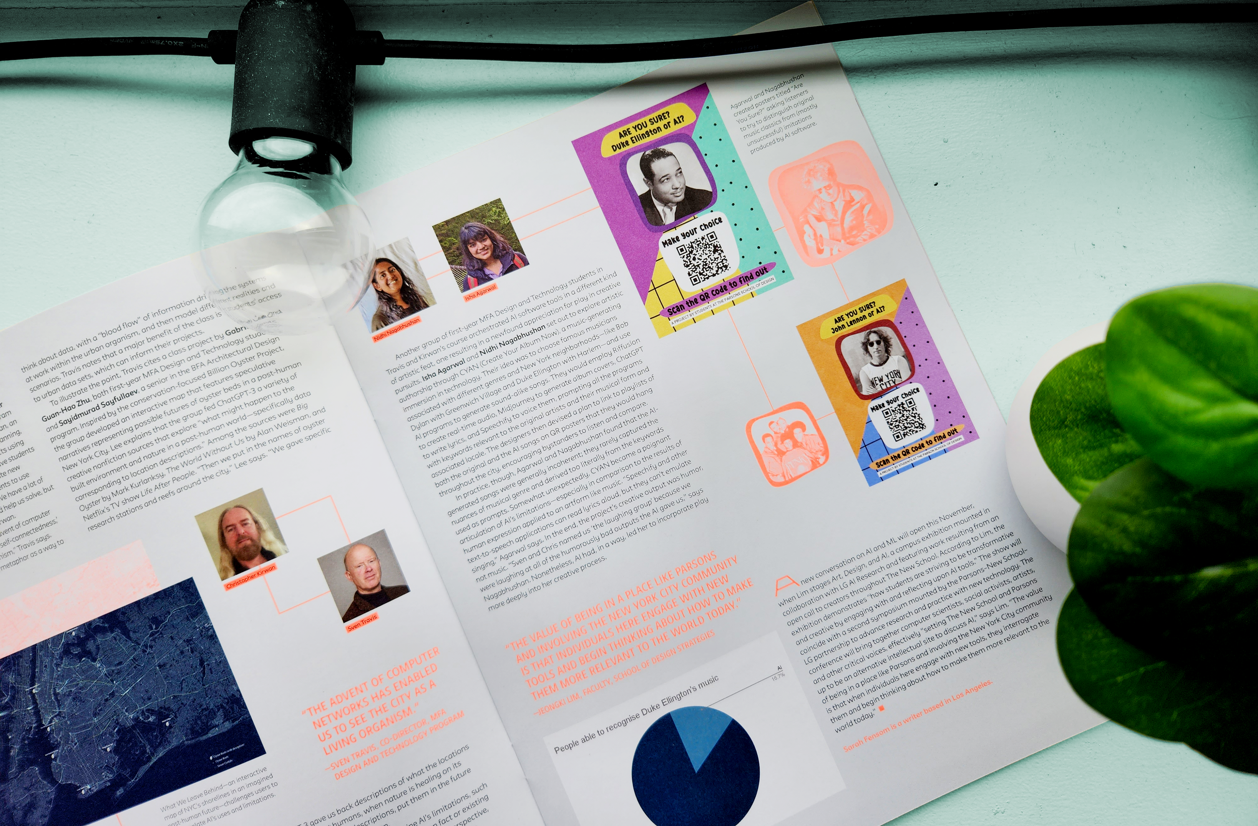
The Colours of New York City
DATA VISUALISATION | This project was a part of my MFA in Design and Technology at the Parsons School of Design. A visualisation of a single aspect of the built form of New York City along Fifth Avenue, this project aims to gather information about how people see the physical characteristics of a space.
The Goal
To map the visual colours of New York City at specific locations and represent them via interactive 3D model.
The Timeline
November-December 2022.
The Process
Conceptualisation, data collection, data extraction, structuring, coding, prototyping, interaction design, data visualisation, testing.
For the second half of my Fall 2022 semester at the Masters in Design and Technology program at Parsons School of Design, I started with picking a theme and exploring it with a series of rapid prototypes over the course of a week. The theme I chose was colours in the context of New York City: a topic I chose to explore because it reflects New York’s vibrance and engages one of the most important ways we perceive the world around us.
For my final project, I chose one of the prototypes I had created and developed it into an interactive and representational model of New York City (depicted above). This data visualisation project involved a series of prototypes, user testing, and coding a 3D model.
The First Prototype
To develop the first prototype, I attempted to map the physical colours of the built infrastructure of the city - the buildings, the fences, the kiosks - in two different locations.
Location 1: South of Madison Square Garden*
Location 2: The southeast corner of Central Park*
The process of making these quick prototypes took the actual colours of the built form through a series of translations - my observations of the colours, translating them into a sketch, and finally translating the sketch into code.
Observations
Both sketches portray the differences in the environment of the city. The first sketch, near Madison Square Park, is in a much more social area - college students, young parents, young office goers. The colours, the built form, and the activity all reflects that. The second area, at the southeast corner of Central Park, is a much more affluent location - the Plaza hotel, a series of large showrooms, huge towering skyscrapers. The colours in the area are more controlled, more polished, and less varied.
Limitations
The two dimensional nature of these sketches does not accurately portray the feeling and volume of experiencing these colours in the city. For the next prototype, I chose to work with a three dimensional volume.
The Second Prototype
The aim of this next prototype was primarily to explore a 3D form and assess its potential in creating a representation of colours as they exist in the city, and experimenting with methods and techniques. Since I wanted to start recording and mapping colours, I documented one block and tried to figure out ways I could translate it into visuals.
I condensed my images into pixels, from which I could then eyedrop colours and come up with a colour palette for the block. For the actual visualisation, I used the 3D visualisation JavaScript library three.js to build a series of blocks of different colours, representing amount and intensity of different colours around the block. The goal of this prototype was to experiment with building a 3D form to represent colour, and to see if that resonated with people in terms of their experience.

Representation of one block, between 5th Avenue & Union Square West and between 15th and 16th streets.
Observations
The prototype worked as a jumping off point for visualising colour data of the city, but the concept and process needed refinement. However, the colour materiality works well, especially with limited opacity for different squares - it works as a representation of layers and layers of information, often hidden behind the restricted layers we can see.
Limitations
One of the points that came up multiple times in user testing was that since the visualisation was essentially a large tower, the form was misleading in that it could be easily read as a large building instead of representations of colour.
Another thing that came up was context. A contextual map overlaid on the model might help give more direction to the prototype. On the other hand, not providing a context plan and instead letting users decode different neighbourhoods just by virtue of their colour palette and volume could be valuable.
The Final Visualisation
The final model combined everything I learned through the prototyping process. I learned and built the entire model in three.js to make it an accessible, interactive project.

Next Steps
This project was interrupted in the middle by a strike at the university, which meant I could not get proper instruction on how to proceed for a bit and therefore could not accomplish all that I wanted to.
Given time, I would like to make the interaction more informative - with overlays on each sphere that detail out the colour, the location, and the exact built element that inspired the colour representation.
I would like to explore how these colours change at different times of day and through different times of the year - both variables have a significant effect on how we perceive colour and the colours of our surroundings.
I would also like to map how the physical colours of a give area correlate to the people who populate it, and analyse if there’s any causation between the two.
* best viewed on a desktop or laptop computer.MORE PROJECTS